
Brand
Why Beautiful Brand Identities Fail the Second They Meet an Ad Campaign
Learn the practical difference between a brand identity built for mockups and an operable visual system engineered to perform across real-world ads, packaging, and digital platforms.
- Published
- Reading time
- 5 minutes
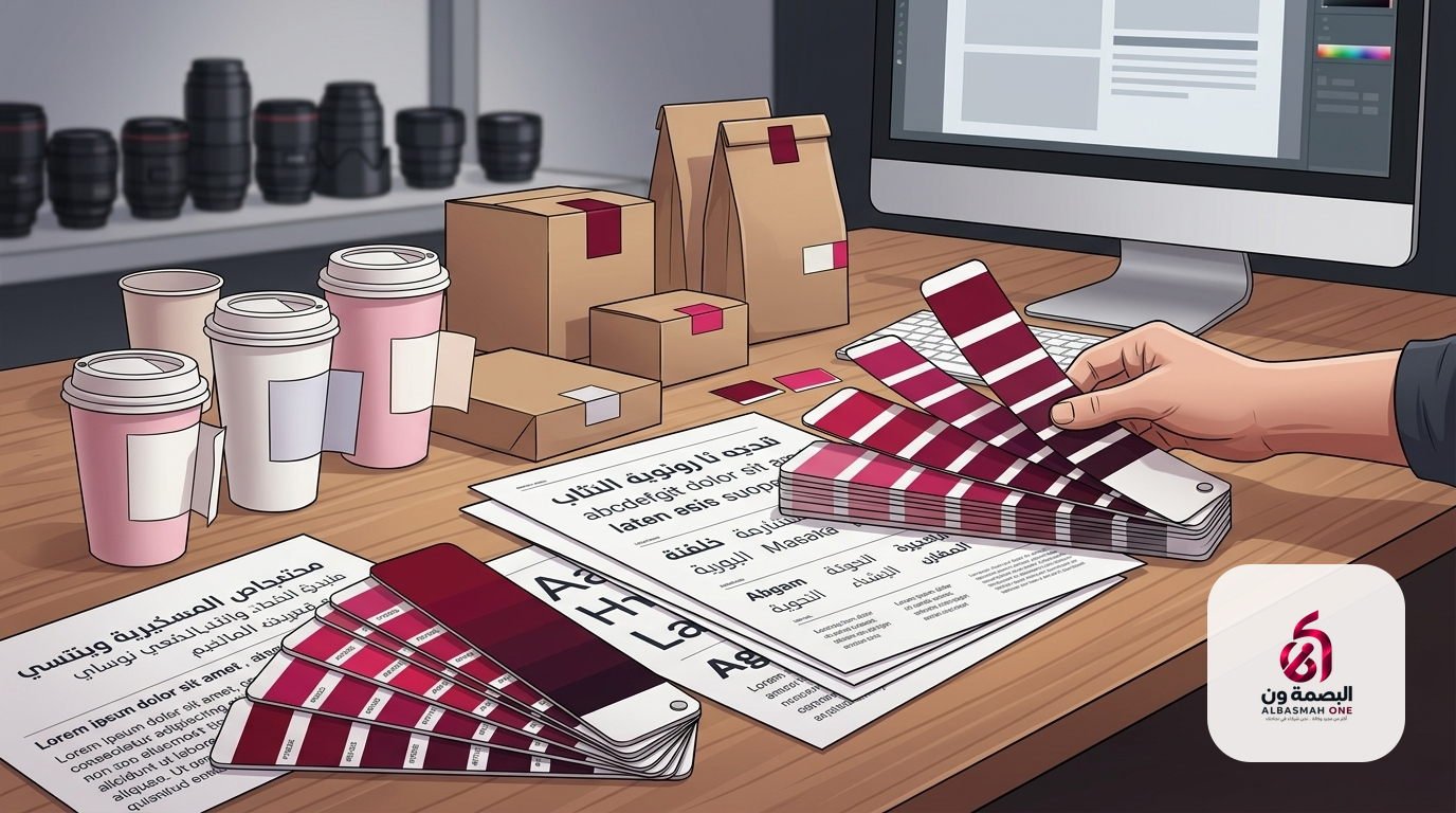
A founder opens a slick fifty-page PDF manual full of embossed business cards, gold foil packaging mockups, and glass storefronts drenched in morning light. The presentation is stunning, and everyone leaves the room convinced the business is ready to conquer the market. Yet three months later, when the team starts running real ads, producing everyday shipping cartons, and setting up an online store, everything crumbles into visual noise. The typography breaks on web browsers, the subtle pastel hues wash out on basic corrugated cardboard, and the logo collapses into an illegible dot inside a social app avatar.
This breakdown is remarkably common. It happens whenever brand identity design is treated as a decorative exercise detached from the rough reality of daily operations.
The Difference Between a Logo and an Operating System
Every emerging business needs a distinct mark, but a logo alone never solves an organization's communication problems. A logo is merely a signature at the bottom of the page; what actually persuades a customer and secures recall is the broader visual language wrapping the entire interaction.
When you commission a dedicated brand identity system, you are not buying an isolated vector drawing. You are buying a system built to solve functional constraints. A working system answers granular questions: How does a pricing tag display cleanly over a crowded photo? What visual cues tell an Instagram user whose video they are watching before they read the account name? How do long Arabic headlines balance alongside concise English subtext without obliterating negative space?
Founders who purchase standalone logos find themselves paralyzed when building out full collateral. If the designer behind the mark never stopped to consider how it functions on an outdoor highway billboard or a tiny mobile screen, the business inherits an expensive puzzle instead of an asset.
Why Most Brand Guidelines Gather Dust
Most agency guideline manuals end up ignored because they stop at color swatches and clear-space rules. While color formulas are handy for commercial printers, they offer zero utility to a growth marketer, an interface developer, or a content creator under daily deadlines.
A practical brand manual must serve as an instruction set for live deployment:
- A defined hierarchy for typography and palettes: which color pulls the eye straight to the checkout button, and which shades stay strictly in the background for utility.
- Photographic and video direction that dictates lighting angles, human expressions, and camera framing, preventing the social feed from looking clinical when the service promises warmth.
- Rigid layout grids for digital creative, ensuring any freelance designer joining your team can construct an on-brand promotional banner in twenty minutes without guessing.
- The master mark supplied across all final file formats, complete with clear instructions on transparent backgrounds, monochrome adaptations, and minimal permitted sizes.
Without these practical rules, teams make ad-hoc visual decisions every morning, rapidly diluting whatever cohesion the business initially purchased.
The True Stress Tests: Packaging and Paid Creative
Two battlegrounds reveal the integrity of any corporate identity immediately: physical retail packaging and vertical digital screens.
In physical packaging, menus, and printed collateral, practical mechanical constraints dominate. Ink behaves differently across uncoated kraft paper, thermal takeaway labels, and rigid boxes. An agency designing solely for digital mockups will leave you with astronomical print setup costs or packaging that looks muddy under standard shelf lighting.
Simultaneously, digital performance requires maximum flexibility. Coordinating brand rules with paid advertising and growth demands visual hooks capable of stopping a distracted thumb in fractions of a second. If your brand guidelines are so rigid that marketing cannot run a prominent discount message in bold, legible typography, your brand identity has turned into an operational liability.
A strong identity does not strangle marketing under the guise of prestige. It hands the growth team sharper tools to move fast without losing recognizability.
Cohesion Across the Digital Footprint
Brands are no longer passive graphics pinned to walls; they are interactive experiences. Your audience encounters the brand when clicking a checkout button, waiting on an interface state, or navigating a dynamic menu. Developing brand assets without integrating them into web and platform development produces a disjointed, frustrating user journey.
The same rule applies to social channels. Cohesive social identity templates must power regular social media management and content production. When identity systems account for recurring content formats, followers recognize your updates instantly by structural framing and typographic cadence alone.
When Is a Rebrand Actually Justified?
Changing an established brand purely out of restlessness or executive boredom is almost always an expensive misstep. Cultivating trust takes sustained, uninterrupted exposure. However, clear commercial signals do indicate when a full rebranding initiative is necessary:
- The business has expanded into adjacent services or broader regional territories that the existing visual identity cannot logically accommodate.
- A visible disconnect exists between operational capabilities and market perception, such as an enterprise tech team operating under amateurish, outdated visual branding.
- Chronic friction occurs every time the team attempts to produce new packaging formats or modern digital content.
- The core audience has shifted fundamentally toward a demographic requiring a completely different visual and verbal tone.
In these transitions, the goal is not abandoning history, but distilling the core promise of the business into a durable framework built for the next stage of scale.
Designing for Real Commercial Pressure
At ALBASMAH ONE, we approach visual design as an operational mechanism, not an art exhibit. Every corporate identity project begins with business strategy to define positioning, followed by exhaustive structural design covering typographic hierarchies, packaging engineering, sales decks, and promotional ad creative.
When your identity works as a cohesive operational system, execution speed accelerates, visual production waste vanishes, and every touchpoint reinforces customer recognition. To see how these principles translate into active platforms, explore our recent case studies, or start a direct conversation with our team through our contact page.
Related services
More reading
 Strategy
The Social Calendar Trap: Why Consistent Posting Alone Won't Grow Your Business
A social feed that posts daily without strategic intent burns your marketing budget in silence. Discover the real difference between filling a content calendar and running a conversion-focused social presence.
 Growth
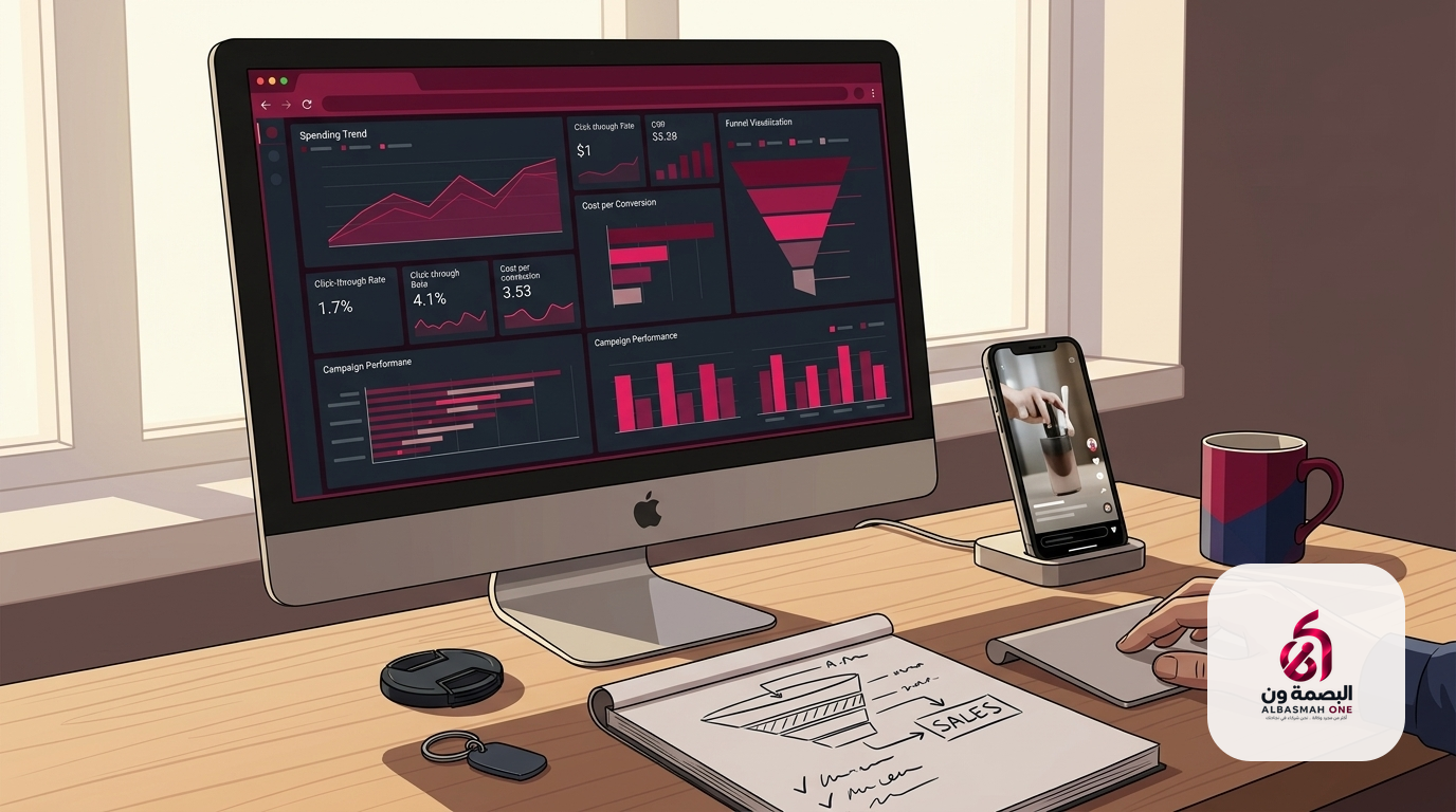
Why Paid Ads Drain Budgets Without Generating Sales
Discover why most paid ad campaigns fail to deliver real revenue and learn how to align targeting, ad creatives, and landing pages to cut customer acquisition costs and drive sustainable store sales.
 Technology
Beyond Visuals: What Turns a Corporate Website Into Commercial Infrastructure
Why sleek design is never enough on its own, and how aligning information architecture, UX, and backend API integrations transforms a company website into a revenue driver.